Designing for COVID-19 education in Bali
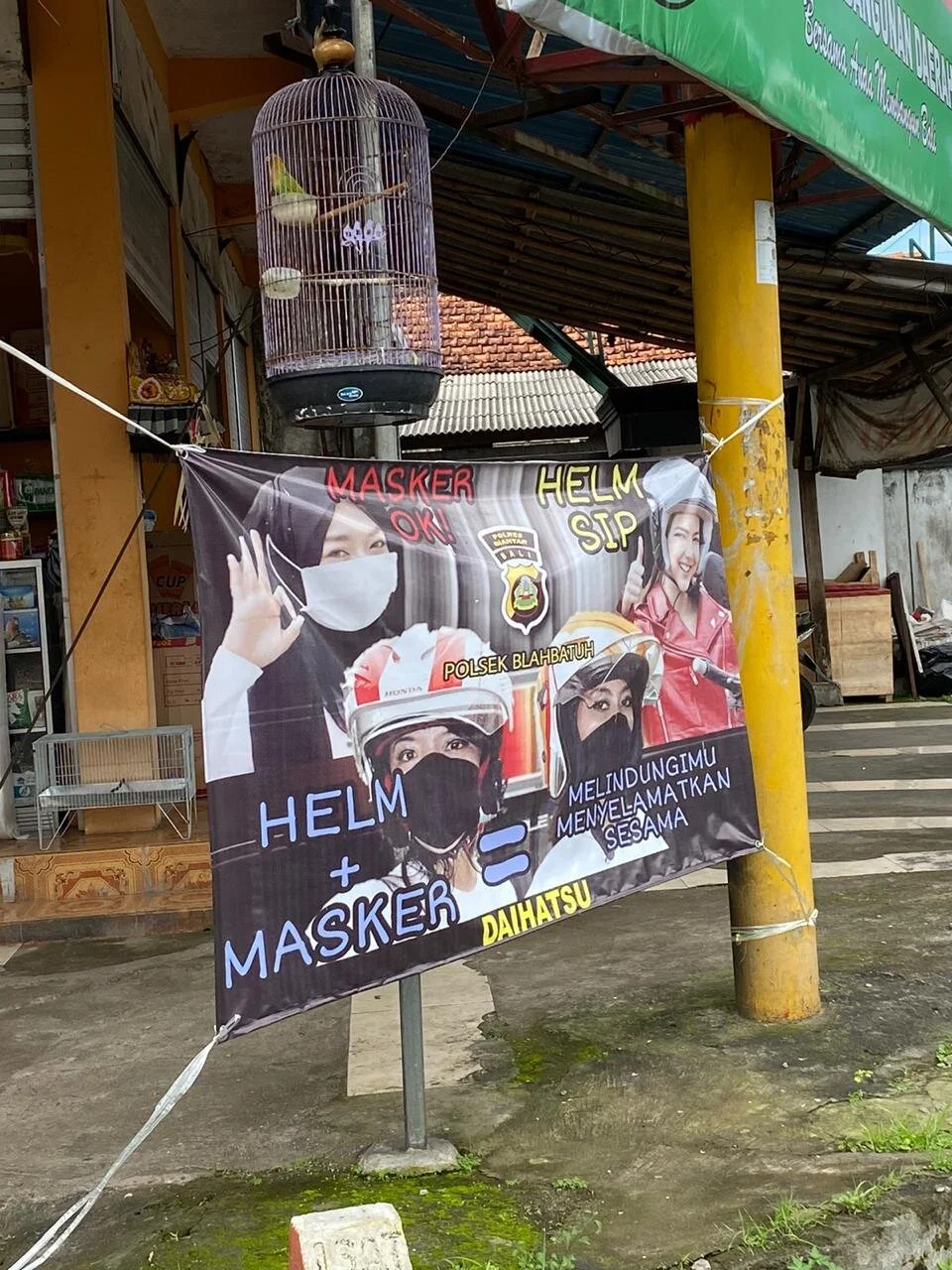
/It’s been really interesting to watch the huge amount of posters, billboards, signs, and graphics pop up in the wake of COVID 19. From simple commands, to Mr Bean cameos, to mask education, and stern threats. The graphics, and different styles have been flooding our eyes and brains for the last 5 months.
So many questions about who the posters are for, who decides what gets printed, font choice, and more… Definitely makes us think about effective design and messaging, and how communication actually works on a human level vs how government/bureaucracy thinks it happens.
Here are a few of our favorites. Special thanks to Suki Zoe for collecting most of the pictures on her travels.
1. Wear a mask 2. Don’t panic 3. Exercise
Petulu village really has the best messaging we’ve seen. Positive and to the point.
Other terms also apply…. that’s a lot of logos and text, Ubud. Points for being bilingual!
Balinese speakers only. At the Ubud wantilan.
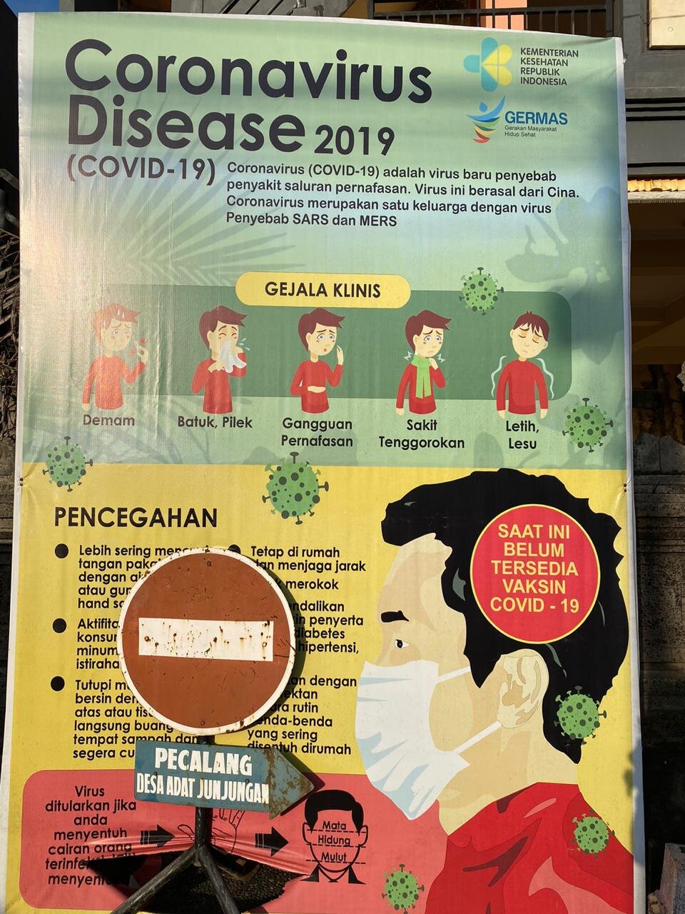
All the official stuff.
Lots of points being made here.
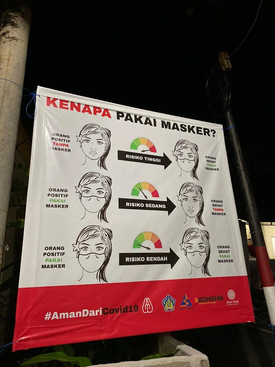
Go Kopernik and Alam Santi for a clear message on masks.
Another one from Petulu
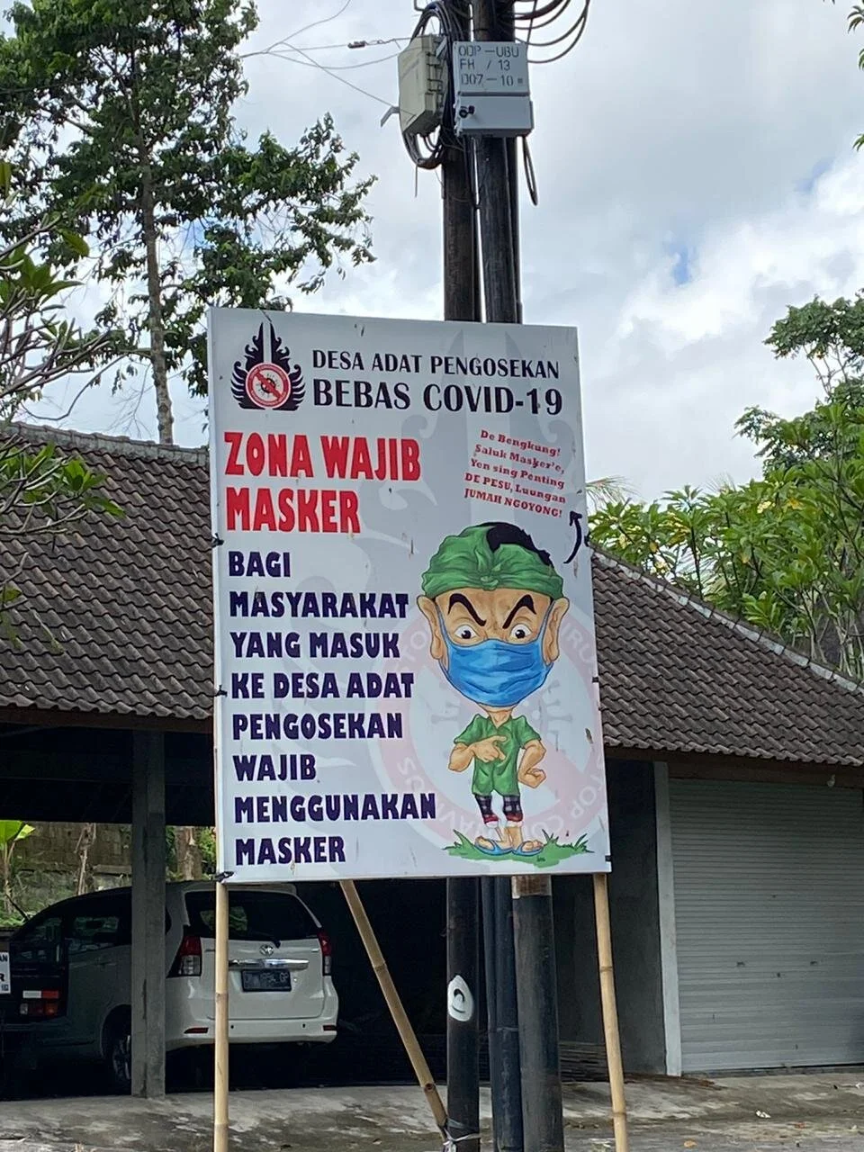
Balinese language and Mr Bean- amazing.
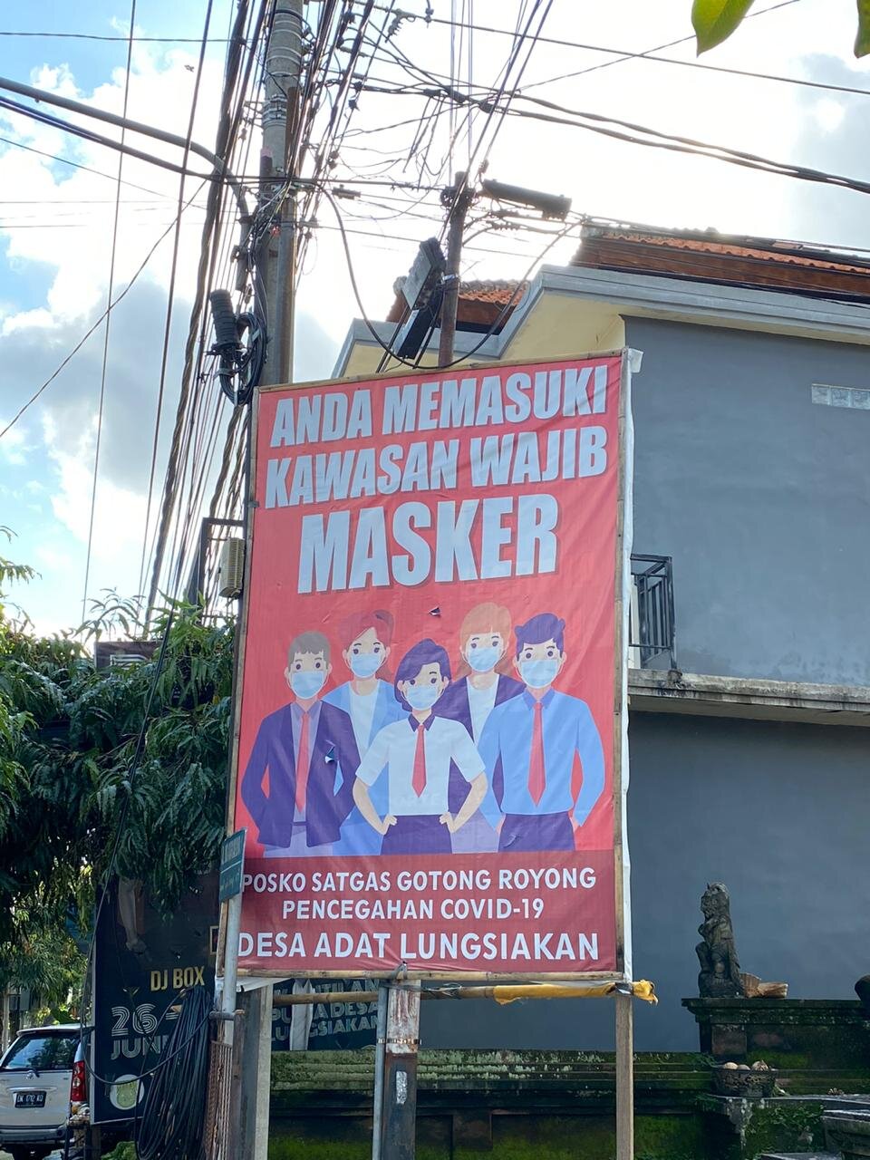
Targeting office workers?
Red is definitely eye catching against Bali’s green.
Health and safety - two in one
How to wash hands- popular in the first month. Replaced by masks now


